Display Grid Layout Responsive Design CSS सीखे हिंदी में |
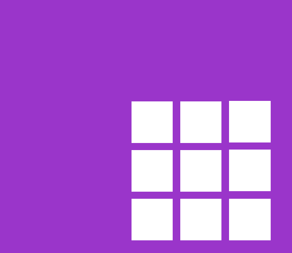
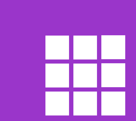
क्या आप भी अपने website में CSS grid layout को लगाना चाहते हैं, तो आप बिल्कुल सही जगह पर है | इस article को पूरा पढ़ने के बाद आप भी इस तरह के layout design कर सकते हैं, जैसा कि इस फोटो में दिखाया गया, वह भी पूरी तरह responsive design जो कि अलग-अलग devices me उस डिवाइस की height और width के according अपने आप को adjust कर लेता है |
इसके लिए बस आपको दिए गए steps को follow करना होगा | उससे related code भी होगा जो आपके layout को बनाने में सहायता करेगा | तो चलिए अब steps को देखें |
Step 1
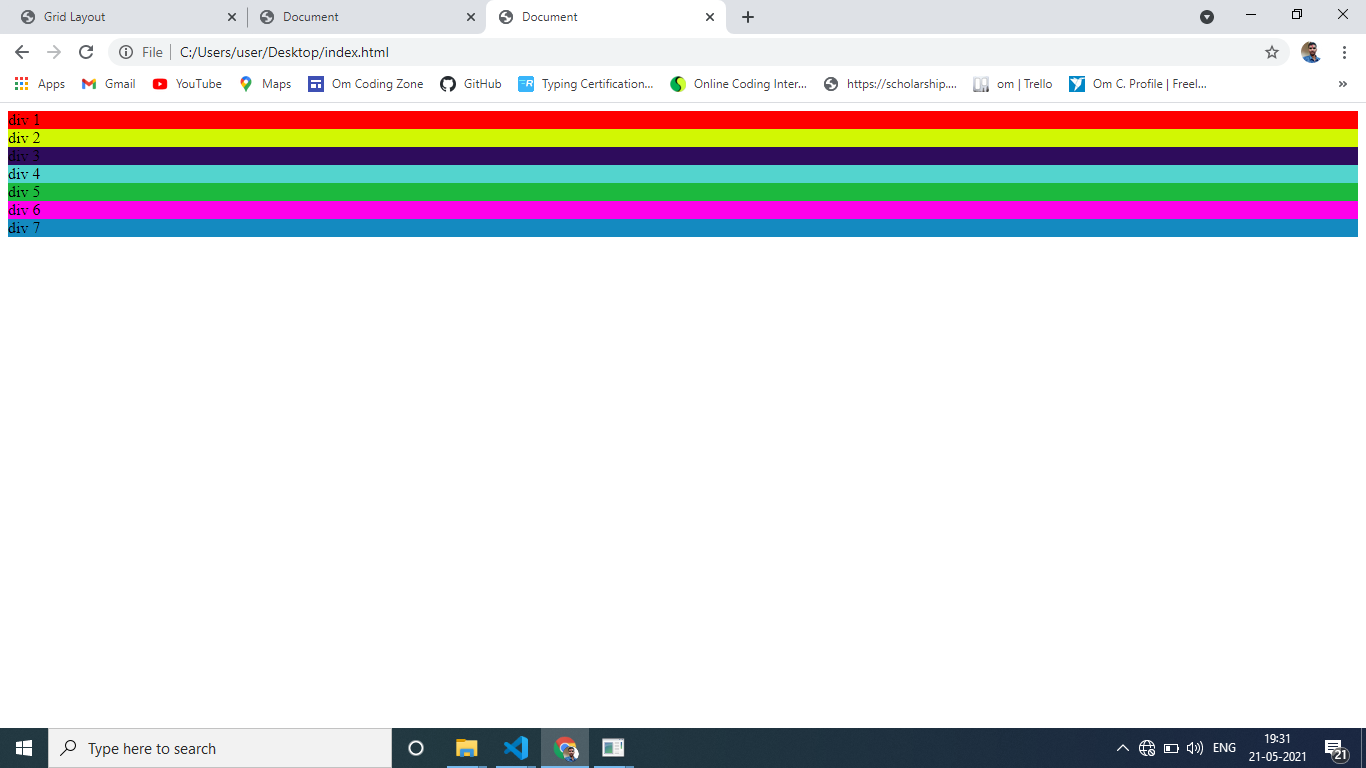
सबसे पहले आपको HTML file बना लेनी है, और body section में आ जाना है।
Step 2
<div class="parent">
    <div class="box1">div 1</div>
    <div class="box2">div 2</div>
    <div class="box3">div 3</div>
    <div class="box4">div 4</div>
    <div class="box5">div 5</div>
    <div class="box6">div 6</div>
    <div class="box7">div 7</div>
</div>
ऊपर दिए हुए picture को देखकर आप parent और child का मतलब समझ सकते हैं। इस code को copy करके अपने body section में paste करें। इसमें child div है जो जिसमें box 1 box 2 box 3 class लगे हुए हैं | div का मतलब box होता है जो box ऊपर picture में देख सकते हैं वह यही box हैं।
मैंने parent div को parent class दिया है और child div को box 1, box 2, box 3, .... करके class दिया है।
Step 3
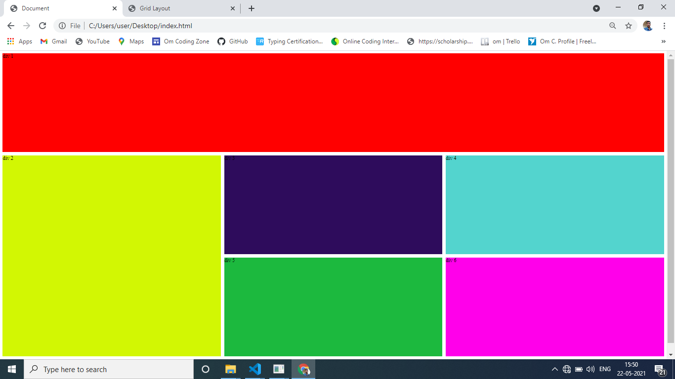
सभी div का background color अलग अलग set कर देते हैं, जिससे यह पता चल सके कौन सा div कहां तक आ रहा है|
अब तक जो हमने किया वह basic था अब main part पर चलते हैं।
.box1{
    background: red;
}
.box2{
    background: rgb(210, 247, 3);
}
.box3{
    background: rgb(46, 12, 92);
}
.box4{
    background: rgb(83, 212, 206);
}
.box5{
    background: rgb(28, 185, 62);
}
.box6{
    background: rgb(255, 0, 234);
}
.box7{
    background: rgb(20, 138, 192);
}
Step 4
.parent{
    display: grid;
    grid-template-columns: 300px 300px 300px;
    grid-template-rows: 300px 300px 300px;
    grid-gap: 10px;
}
or
.parent{
    display: grid;
    grid-template-columns: repeat(3,300px);
    grid-template-rows: repeat(3,300px);
    grid-gap: 10px;
}
.parent{
    display: grid;
    grid-template-columns: repeat(3,1fr);
    grid-template-rows: repeat(3,300px);
    grid-gap: 10px;
}
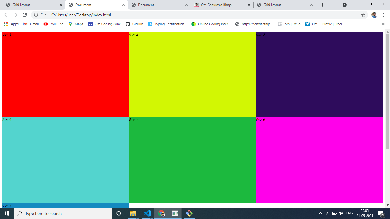
grid-template-rows का प्रयोग कितना rows use करना है उसके लिए किया जाता है, तथा grid-template-columns का प्रयोग कितना columns use करना है उसके लिए किया जाता है।
grid-template-columns में पहली div की width को लिखकर फिर space देते हैं फिर दूसरे column की width लिखते हैं फिर space देते हैं फिर तीसरे column की भी लिखते हैं,
और grid-template-rows में पहली div की height फिर space फिर दूसरे div की height space ऐसे करके हम लिखते रहते हैं।
जब same values पास करनी होती है तो हम लोग repeat का use कर लेते हैं। repeat function दो और arguments लेता है पहला कितने rows coloumn चाहिए दूसरा कितनी height या width चाहिए,
column के लिए width और row के लिए height होती है।
fr बचा हुआ complete width ले लेता है| repeat(3,1fr ) पर यह तीनों div को बराबर भागों में बांट कर पूरा width cover कर लेता है। as shown in picture
grid-gap box के बीच में कितना gap चाहिए उसके लिए use होता है।
Step 5
Difference between column-row and line
अब हम line और row column का अंतर समझ लेते हैं, क्योंकि अब हमें row column को नहीं छूना है|
अब हमें बस line का ही ध्यान रखना है|
अब हम child box की styling करेंगे, अब हम जिस child div को जिस line से जिस line तक ले जाना चाहते हैं ले जा सकते हैं।
मान लो हम column line 1 से लेकर column line 3 तक किसी div की width रखना चाहते हैं तो हम gird-column का use करेंगे, यह property child div में लगाएंगे जिस भी child को जिस line से जिस line तक ले जाना होगा| इसे कुछ इस प्रकार लिखेंगे|
grid-column: 1/3;
यदि हम किसी div की height को row line 2 से 4 तक रखना चाहते हैं, तो हम grid-row का use करेंगे इसे कुछ इस प्रकार लिखेंगे|
grid-row:2/4;
.box1{
    background: red;
    grid-column: 1/4;
}
.box2{
    background: rgb(210, 247, 3);
    grid-row: 2/4;
}
अगर आप चाहते हैं कि row और column की संख्या चाहे जितनी बढ़ जाए लेकिन उसका height और width पहले से decied रहे तो आप grid-auto-rows, grid-auto-columns parents में दे सकते हैं।
.parent{
    display: grid;
    grid-template-columns: repeat(3,1fr);
    grid-template-rows: repeat(3,300px);
    grid-gap: 10px;
    grid-auto-rows: 300px;
}
Step 6
@media screen and (max-width: 992px) {
    .box3 {
      grid-column: 2/4;
    }
  }
website को अलग-अलग devices में access करने के लिए उसके width के according उसको set करने के लिए media screen का use करते हैं इसे Responsive website भी कहते हैं जो ऊपर दिया गया कौन है|
इसमें website को उसके width के according कम से कम कितना width होना चाहिए उसको max width के अंदर लिखते हैं और उसके अंदर जिस box को जिस लाइन से जिस लाइन तक ले जाना रहता है उसको ले जाते हैं जैसे कि box3 को हम लाइन 2 से line 4 तक लाना चाहते हैं जो कि पहले line 2 से line 3 तक था उसे हम ऊपर दिए गए code की तरह लिख सकते हैं
आशा करता हूं आपको CSS grid समझ में आ गया होगा article को पूरा पढ़ने के लिए धन्यवाद |
.gif)